Since the beginning of this pandemic, many questions have been asked about it. Will its effects be reduced during the summer months? Does heat have any effect on this virus as it has on other viruses?
We can find both statements by Donald Trump where he speaks of a second outbreak in autumn (assuming that during the summer there will be no or many infections will be reduced) and articles from the BBC or El País talking about this issue, wanting to believe that the summer and the heat will quell the virus.
But how much truth is there in this? We can see several studies talking about these issues. First, the most basic. A study carried out by the University of Marseille (Pastorino et al.) where they perform different tests in the laboratory checking the resistance of the virus to high temperatures. This study is a pre-print (it has not been peer-reviewed) but it does not serve for now to illustrate that, a priori, high summer temperatures will not kill the virus. The results show that the virus has a fairly strong heat resistance and needs several hours of very high temperature to die.
On the other hand, we have an extensive Chinese report relating contagions with climatology, with negative results in terms of this correlation. However, if there is a downside to this report, it is precisely that it is Chinese data. The huge deployment that China made to stop the virus, including completely confining Wuhan, led to the virus spreading in a very limited way throughout its geography, so I think it is difficult to know with these scarce data the possible correlation.
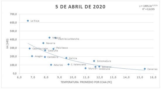
We also have a small report from AEMET where a timid correlation is made between the average temperature and the number of infected in Spain. We can see the resulting graph in the following figure.
Now, with the large amount of data we already have, we can do a new analysis. Of course, trying to directly correlate temperature with the number of infections without taking into account other factors does not make much sense. Therefore, for a quick analysis I thought it might be ideal to use American data, where the virus has spread at great speed without too many impediments and the data are easy to acquire. Comparing different countries with each other does not seem to make much sense to me because there will be many different factors that explain the spread of the pandemic such as previous measures, healthcare, etc. However, by focusing on a single country with more or less uniform measures, with a large area and population we can obtain interesting results, so the USA seems ideal for this. Also, with respect to the Spanish data, we will use machine learning methods to see more than one factor in the relationship, since Asturias and Madrid (for example) obviously do not have the same population density although they may have similar temperatures, which should be a relevant factor.
On the one hand, the data on deaths by COVID by state. As we discussed in the previous post in this blog, I believe that using the death data is more useful than the infection data, so I will use that measure to see how the pandemic is progressing. I get that data from this NY Times proprietary git, which also contains state-level and county-level death data.
Data on population density and total population can be found here: https://worldpopulationreview.com/states/
While the temperature data for the last month can be found here: https://www.ncdc.noaa.gov/cag/divisional/mapping/110/tavg/202003/1/value
As this article will be shorter I will explain a little bit the steps I follow to get the right format for the data.
* Data preparation
COVID
As mentioned before, we use the data by state, using ‘pandas’. I want only today’s data (the day I initially write this article, April 22), so I choose the data corresponding to the date and then using the ‘iloc’ tool of pandas, I choose columns 1 and 4, those corresponding to the state and deaths.
a = pd.read_csv(‘covid-19-data-master/us-states.csv’)
states = a[a[‘date’]==’2020–04–22']
states = states.iloc[:,[1,4]]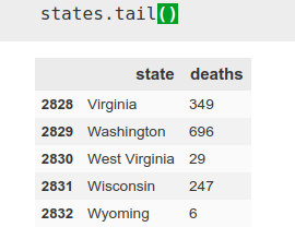
Population
Again, we read the ‘csv’ using pandas and choose the data we are interested in. In this case they are columns 1, 2 and -1, corresponding to state, population and population density, to which we also change the name so that they have homologous names with the previous DataFrame.

data = pd.read_csv(‘data.csv’)
data = data.iloc[:,[1, 2, -1]]
data.columns = [‘state’, ‘population’, ‘population density’]
Temperature
This CSV is a bit more complicated, but nothing we can’t fix.
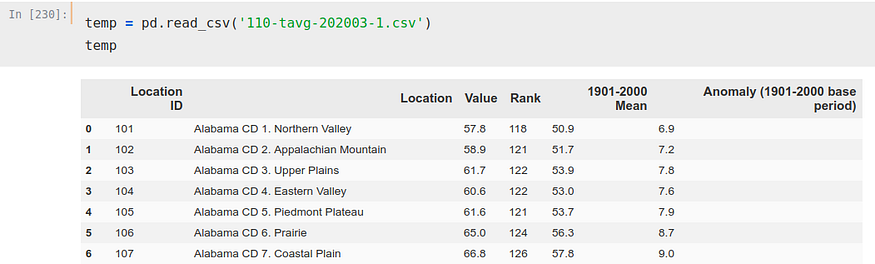
We can see how there are several ‘Location’ for each state, 8 only for Alabama. This could be solved in several ways, but as we seek to solve this problem merely as a guideline and out of curiosity we will not complicate too much. We will simply choose one of the rows per state to perform the calculation, to be exact, the ‘CD 1.
For it, we iterate on that column ‘Location’ and we create a new list separating removing to each state the ‘CD 1.’, to, next, make that list the column ‘Location’.
newloc = []
for i in temp['Location'].values:
    newloc.append(i.split(' CD 1.', 1)[0])
temp['Location'] = newloc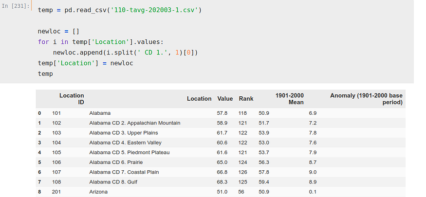
Now, we iterate again, this time over two columns, index and ‘Location’. With this iteration we have created a list where we have stored the indexes we want to use to obtain our DataFrame.
indexxxx = []
for i, j in zip(temp.index, temp['Location']):
    if 'CD' not in j:
        indexxxx.append(i)
Now, we simply copy those indexes, using ‘iloc’ again to select the rows we want and the columns (1 and 2, the ones corresponding to location and average temperature). We also rename the columns, so that they are in the same format as our other two DataFrames.
temp = temp.iloc[[0, 8, 15, 24, 31, 36, 39, 41, 48, 57, 67, 76, 85,
 94, 103, 107, 116, 119, 127, 130, 140, 149, 159, 165, 172, 180,
 184, 186, 189, 197, 207, 215, 224, 234, 243, 252, 262, 263, 270,
 279, 283, 293, 300, 303, 309, 319, 325, 334], [1, 2]]temp.columns = [‘state’, ‘temperature’]
We already have all the DataFrames prepared, so we can unify them all in one and perform the calculations. In addition, we made a new modification, replacing in the DataFrame the deaths by deaths per Million.
merge1 = states.merge(data)
merge2 = merge1.merge(temp)
merge2['deaths per M'] = merge2['deaths']/merge2['population']*1000000
merge2.drop('deaths', axis=1, inplace=True)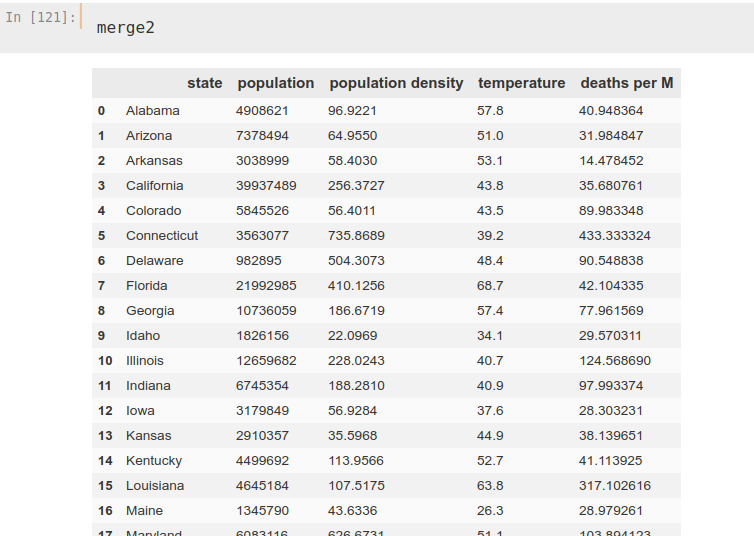
Regression
Now, we could divide our data into ‘training’ and ‘test’ but I think that in this case it is not the most useful, since we are not doing a regression with temporal data. Therefore, I think the ideal in this case is to use ‘cross-validation‘. This method divides the dataset into x different parts, so that the training trains on x-1 and tests its validity on 1 of those parts. In this spirit, we make a division in 5 parts of this dataset, using the ‘regressor‘ ExtraTreesRegressor.
from sklearn.ensemble import ExtraTreesRegressor
from sklearn.metrics import mean_absolute_error
from sklearn.model_selection import cross_validateETR = ExtraTreesRegressor()X = merge2.iloc[:,[1, 2, 3]]Y = merge2.iloc[:,[4]]cv_results = cross_validate(ETR, X, Y, cv=5, scoring='neg_mean_absolute_error')
Thus, we obtain the following mean absolute error (in negative, sklearn function)

We can see, if we use the ‘feature importances’ tool, the importance that the algorithm is giving to each factor once it is ‘fitted’.
ETR.fit(X, Y)from matplotlib import pyplotpyplot.bar(X.columns, ETR.feature_importances_)
pyplot.show()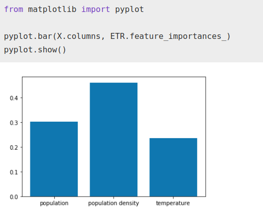
Data filtering
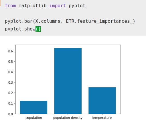
However, we have not filtered too much, which is usually the main factor in getting a good result in this type of work. We have New York, which by counting the entire state instead of just the city, gives a much lower population density even though it has the most densely populated area in the country along with the highest death rate per million, so it may be confusing the algorithm. It might be beneficial to separate the data for New York City and its suburbs from the data for the rest of the state, but we won’t go to that trouble so as not to change the method. Filtering and leaving out New York, we perform these calculations again
merge1 = states.merge(data)
merge2 = merge1.merge(temp)
merge2['deaths per M'] = merge2['deaths']/merge2['population']*1000000
merge2.drop('deaths', axis=1, inplace=True)
merge2 = merge2[merge2['state']!='New York']
Performing the same algorithm again…
from sklearn.ensemble import ExtraTreesRegressor
from sklearn.metrics import mean_absolute_error
from sklearn.model_selection import cross_validateETR = ExtraTreesRegressor()X = merge2.iloc[:,[1, 2, 3]]Y = merge2.iloc[:,[-1]]cv_results = cross_validate(ETR, X, Y, cv=5, scoring='neg_mean_absolute_error')
We see how the error has decreased considerably

While the importance factor that the algorithm gives to temperature has increased with respect to total population, it still remains well below population density as normal.
Of course, these results may be purely coincidental, correlation does not imply causation, but it is a curious correlation and a factor that could be studied.
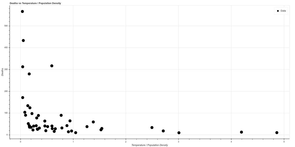
The graph resulting from correlating temperature versus deaths after eliminating New York is as follows:
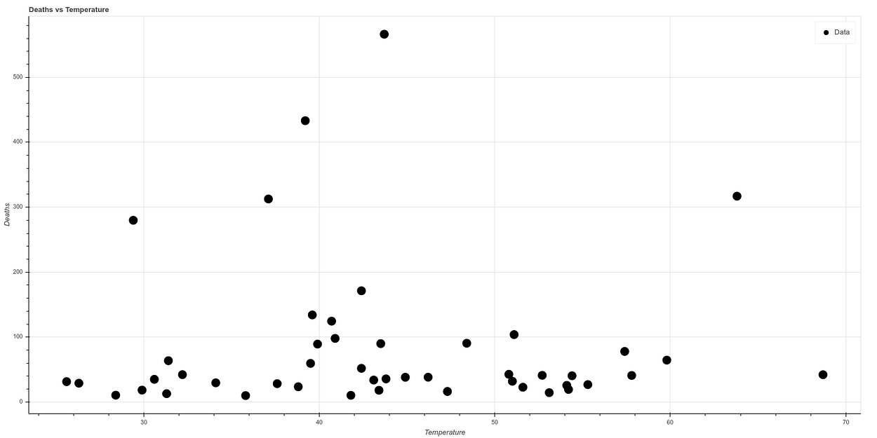
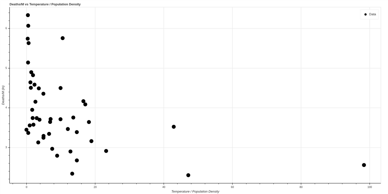
And if we make a new graph, dividing temperature by population density, to correlate in a simple way both concepts, we see what looks like a graph with a quite clear correlation. The higher the temperature and the lower the population density, the lower the death ratio, while all cases of high mortality occur in states of low temperature and high population density.
If we make a logarithmic scale to visualize the curve better, we obtain a curve very similar to the one obtained by the AEMET, which can be seen in the following graph, where the data have been normalized.
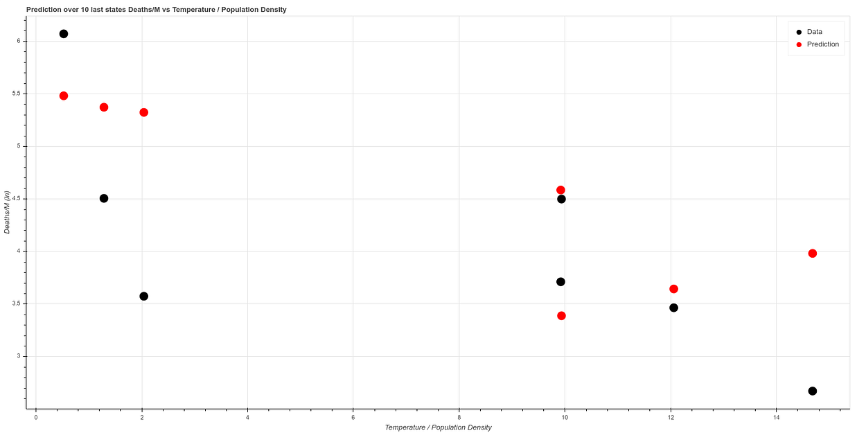
Fitting the algorithm on the first 41 states and testing on the 7 states we obtain a result similar to this one:
You can find all these calculations in our git: https://github.com/ATG-Analytical/COV-19-forescast/tree/develop
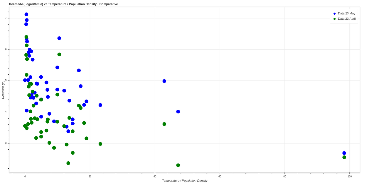
A month has passed since I did this analysis, plotting again a month later (May 23rd) we get very similar data, which seems to confirm this theory. Here we can see a comparison between both data.

No comments