Ever wanted to represent a timeline events on a map, defining different magnitudes? You can see here an example using Kepler.gl, a great tool developed by Uber. For this example I downloaded earthquake data from the spanish institution that manages this data, the IGN (Instituto Geográfico Nacional). The data is located in the following web http://www.ign.es/web/ign/portal/sis-catalogo-terremotos and I selected data from 1 January 2020 until 12 June 2020.
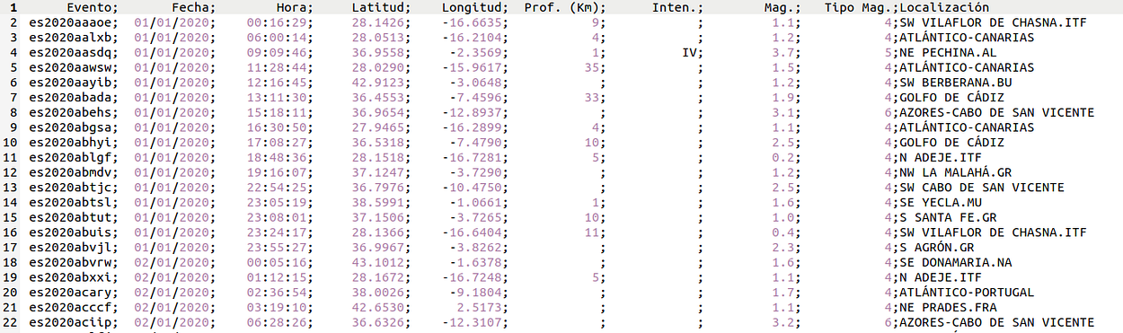
The data looks something like this, before representing them we have to format them a bit. Basically, we join the ‘Fecha’ and ‘Hora’ columns so we have a joint datetime column, and we drop the incomplete data. For example on the above image we can see that the ‘Prof. (km)’ data that does not contain data on all rows, so we drop them in order to only have the most important data.
We want to representate clusters of eartquakes that happen in close places. The color of these clusters will depend on the intensity of them. We also want a timeline, so we can see the evolution of these earthquakes through the time. The result is the following:
We also can add other layers so we have more information. In this case I have added some depth bars and have turned the map into a 3d version, so we have a more complete overlook of the situation. Here you can see an screenshot of the 3d data.
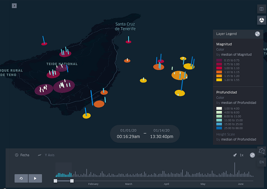
And here, the new interactive map with this newly added feature.
No comments