The effects of this pandemic are being very serious and we cannot help but look to the future to know when our life will return to some kind of normality.
From my limited experience and looking for the day when we can leave we decided to make a study on the spread of this virus, making a model that predicts the consequences in the coming days. I will go on to give some hints about the approach of this study.
The data we will use are the official data from the ECDC (European Centre for Disease Prevention and Control), downloadable here: https://covid.ourworldindata.org/data/ecdc/total_cases.csv
First, how are we going to measure the extent of this pandemic in each country? A priori, the data that could be given the most attention is the total and daily cases registered.
We can follow the following reasoning: the incubation period for this virus is approximately between 2 and 10 days, with a median of 5 days and taking into account the fact that 97.5% of those infected will have presented symptoms before 11 days. So, we can roughly assume that the infected detected today are people who were infected 10 days ago. Now we must add the next part, how long does it take for a person to die once they have symptoms? There are many aspects to this: the viral load the person has received, previous pathologies, the “strength” of the person, etc. In any case, let us assume again an average of 5 to 10 days in which a person presents symptoms until he/she dies.
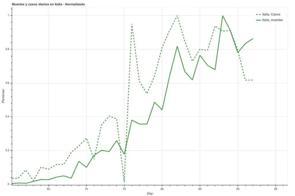
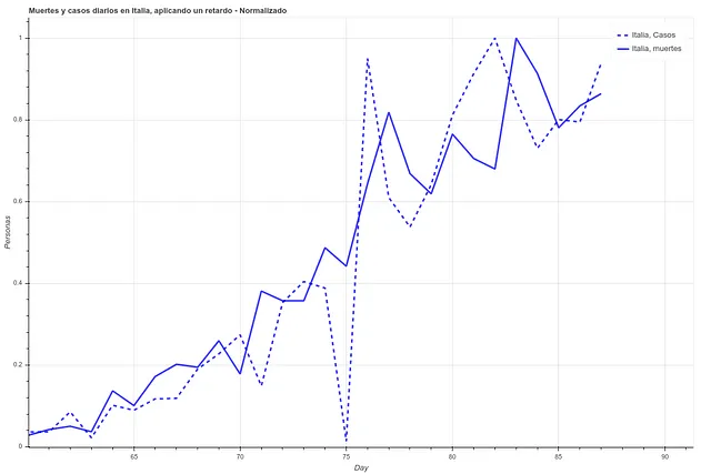
In the following two images we can see the deaths and the daily cases registered in Italy during the last 27 days, first the data as it is and then applying a simple delay of 5 days. We can see how the correlation increases once we have applied this time difference.
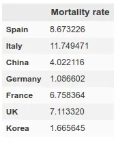
However, here we run into a problem. Since each country has very different mortality rates (see mortality table) it does not seem that we can take the number of infections as a reliable measure. Spain and Italy have two of the best health systems in the world (according to OMS, both countries are in the ‘top 10’), yet both countries have the highest mortality rates among the countries where infection is most widespread.
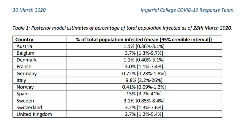
This indicates that this virus is much more widespread than the numbers of infected people, which we can confirm by looking at some studies (such as this one produced by the Department of Epidemiology of Imperial College London), which gives figures of millions of infected people in both countries, although the official data gives data of around 100k infected people as of April 1st, when this article is written. If we apply the mortality rate of countries where tests have been carried out more extensively, such as Germany or South Korea, to the absolute number of deaths, we obtain a number of infected people in Italy and Spain of more than one million. The Imperial College study mentioned above gives data for Spain of 15% of the population infected, which translates into more than 7 million infected. We can see a table with these results here.
In any case, we can see how these figures range in quantities too large to be used in a prediction study unless we also have the number of tests performed per day, a number that is not provided in most countries. Therefore, to see the evolution of the pandemic we will focus on a more objective and measurable data, the deaths.
We will take 3 different types of factors. On the one hand, the spread factors. The average COVID19 spread factor is estimated to be between 2.5 and 2, i.e. the number of new infections created by an infected person. This number can be estimated to vary given the sociability of the people (higher in Italy or Spain) or the social customs (the close treatment in these two countries). We could also take into account that these 2.5-2 infections will not occur on the same day. In any case, we could discuss a lot what would be the ideal number, but we will put 3 geometric factors to represent this: 2.5, 2 and 1.5.
We create a geometric function, i.e. a function where the element i-1 is multiplied by the same number always to produce an element i. Subsequently, this function will be constrained by factors affecting its propagation.
To visualize this (using the propagation factor 2.5):
Day 1: 10 person infected
Day 2: 10*2.5 = 25 infected persons
Day 3: 25*2.5 = 62.5 people infected
Day 4: 62.5*2.5 = 156.25 infected persons
Now, this is a propagation without limits. At some point, all governments have taken measures of social distancing, cancelled mass gatherings of people, established states of alarm, and so on. So we add a second parameter to the previous function. Let us suppose that on day 5 from 0 the government bans gatherings of more than 5000 people (a measure that France took on February 29, when it counted 2 total deaths). Let us assume this as a factor 0.5.
Day 5: 156.252.50.5 = 195.33
Day 6: 195.332.52.5*0.5 = 244.15
The propagation has slowed down. Now we do this for a number of different factors and set these series for various countries. Below we can see the example of China, where the alarm was raised and all kinds of events where there was social contagion were cancelled on day 12 after the contagion.
As we commented earlier, from infection to death we are establishing approximately 20 days from day 0 (~5-10 incubation, ~5-10 disease), so to calculate deaths today, we will use the spread data from 20-15 days ago.
In that same table we can see how the first factor is the day. We will take the days since a ‘day 0’, which we will consider to be 10 days prior to reaching a total of 5 deaths in that region, so that we can establish that day 0 as a start of community contagion.
Finally, the number of infections does not seem to be a particularly reliable factor. To replace it, we will use the absolute number of deaths between 5 and 10 days prior to the day we want to calculate, so that we have some measure of how immersed the virus is in that society.
We therefore have 3 different types of factors:
- Total number of deaths 5-10 days ago
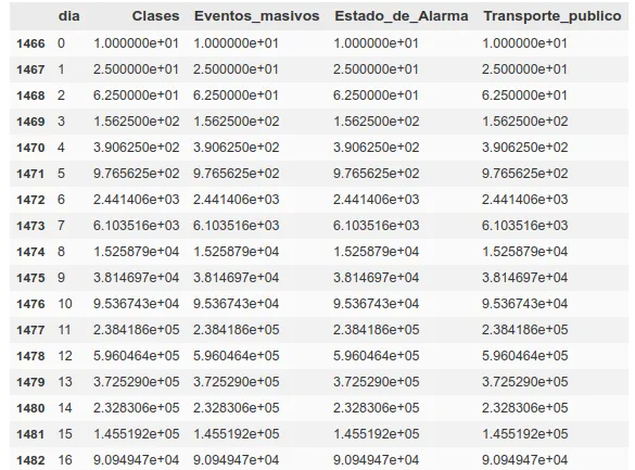
- Expected spread of virus 20-15 days ago (for different factors, state of alarm, public transportation, exercise in public, stores open to the public, classes open)
- Days since onset of community infection
We put them all together, finally obtaining 17 different factors, of which there will be 2 for deaths, 1 for the daily count and 14 for spread (those for spread and deaths are doubled, taking the data from two different temporalities, 10-5 and 20-15).
The large scale growth factors such as the total number of deaths and the spread rates are converted to logarithmic scale and divided by the population of each country, which will facilitate their handling later and give us a more realistic view of the relative growth for each case. In addition, after conversion to logarithmic scale, we normalize the data so that the algorithm does not consider some data more relevant than others. The data chosen to train the algorithm are those relating to China, Italy and Spain, since these are the countries where contagion has been most relevant and the data concerning confinement are easy to obtain.
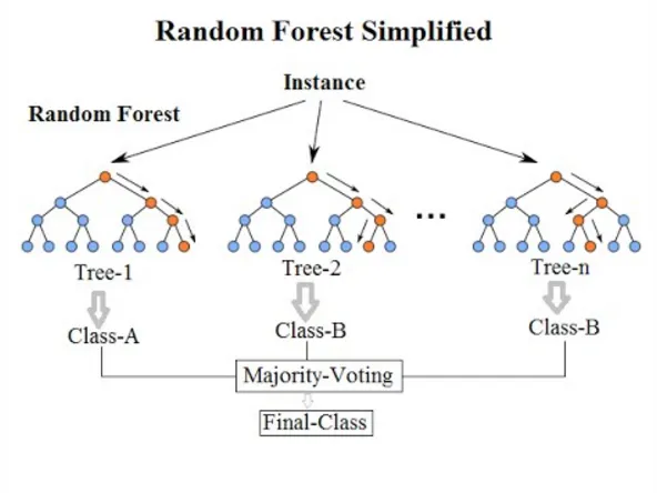
Before applying the algorithm, we need to reduce the number of factors. We, by eye, have decided that these factors are relevant, but we have not done any calculations outside of reading articles and guessing that they might be useful. To see their possible usefulness, we use a tool called ‘SelectFromModel‘, which, given sklearn’s own algorithm, decides which of the factors in our ‘x’ (the factors from which we want to predict) are best at predicting our ‘y’ (the value we want to predict). To estimate which of the x’s are more relevant we use the ‘ExtraTreesRegressor’ algorithm, which is basically a decision tree similar to a ‘Random Forest’.
Once we have passed this algorithm, we have our ‘x’ in a smaller dimension (between 8 and 5, depending on each case). We pass this data through a neural network ‘LSTM’, which is a more powerful tool than a decision tree, obtaining ‘fits’ similar to the following (in deaths per million):
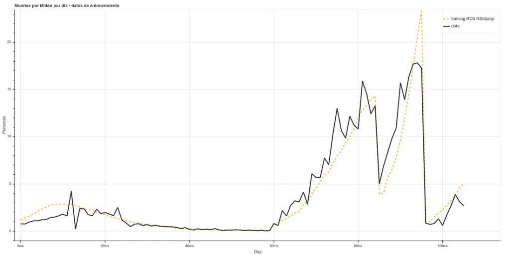
The training is composed of the Chinese, Italian, Spanish and part of the English data ‘staked’ one after the other, starting 20 days after day 0. As the prediction for day X is based on data from, at least, X-5, we can make estimates 5 days ahead (or more, if we make new predictions based on the past ones, but we will make only 5 days for now).
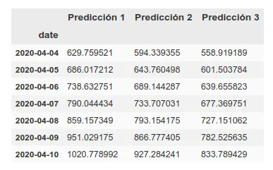
The estimate for the next 5 days in the UK would be as follows:
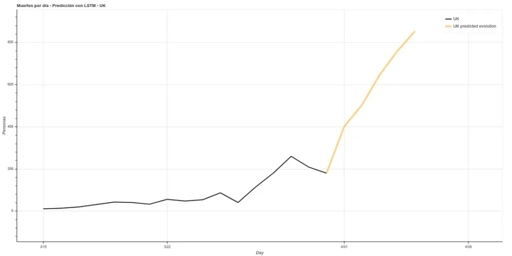
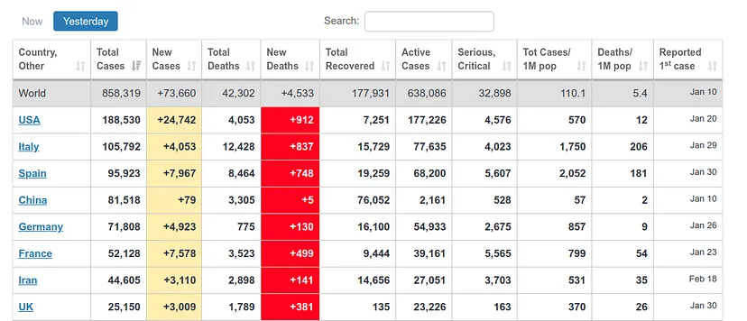
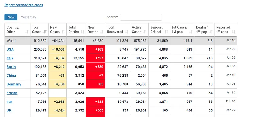
It estimates about 400 deaths for April 1st, the day I am writing this article. However, the ECDC data update counts data after one day, i.e., the data it will present today is the data that each country published the day before. Therefore, we can see if our prediction was good. At https://www.worldometers.info/coronavirus/ we can see a table of the updated data for each country, and we can see that for UK yesterday (our predicted data for today) there were 380 deaths and today (our predicted data for tomorrow) there were 563 deaths, which corresponds quite well with our prediction.
Disclaimer: we are not experts, so we may have made some obvious errors in the epidemiological part, just because the model ‘fits’ does not mean it is reliable, all the more so when this has been done in a few afternoons.
The notebook used to reach these results is the following: https://github.com/ATG-Analytical/COV-19-forescast/blob/Develop/WhoDataset%20-%20LSTM%20-%20SelectFromModel%20-%20Prop.ipynb
Technical explanation of the steps followed to make the notebook here: https://medium.com/atg-analytical/using-lstm-to-get-a-coronavirus-evolution-prediction-on-uk-data-8830f65a3c31
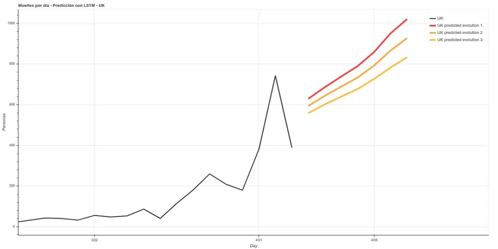
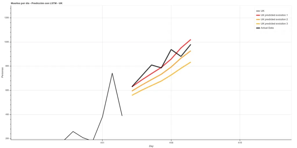
Update: 7-day forecast in UK. There are 3 models that have approximately the same accuracy over the training phase (~16%). Personally I believe more in prediction 1 but here you can see all 3.
7 days later (April 11th update), we can see the results of that prediction. The results are quite good, following ‘Prediction 1’.
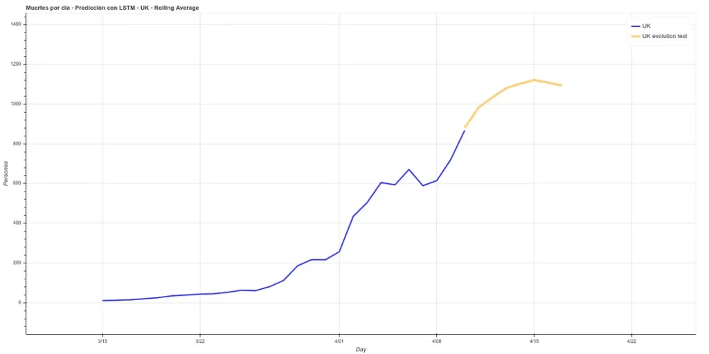
I have added a small update to the code, changing the absolute deaths data, making a rolling average of 3 days, so that peaks are eliminated for each case. A 3-day rolling average would basically mean that for each day’s data the average is made using the current data plus those of the surrounding days, thus smoothing the curve, which could facilitate the prediction. Here is the new prediction:
This prediction has an average error in training of ~7%.
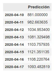
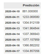
On the other hand, we maintain the prediction with the same methods we used before, which have improved their accuracy by having more training data up to about 6%. This prediction gives a higher projection although it also coincides with that of the rolling average in an arrival at peak kills next week.
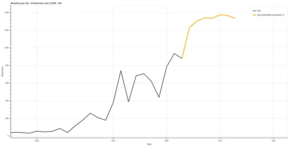
The graph with both predictions would look like this.
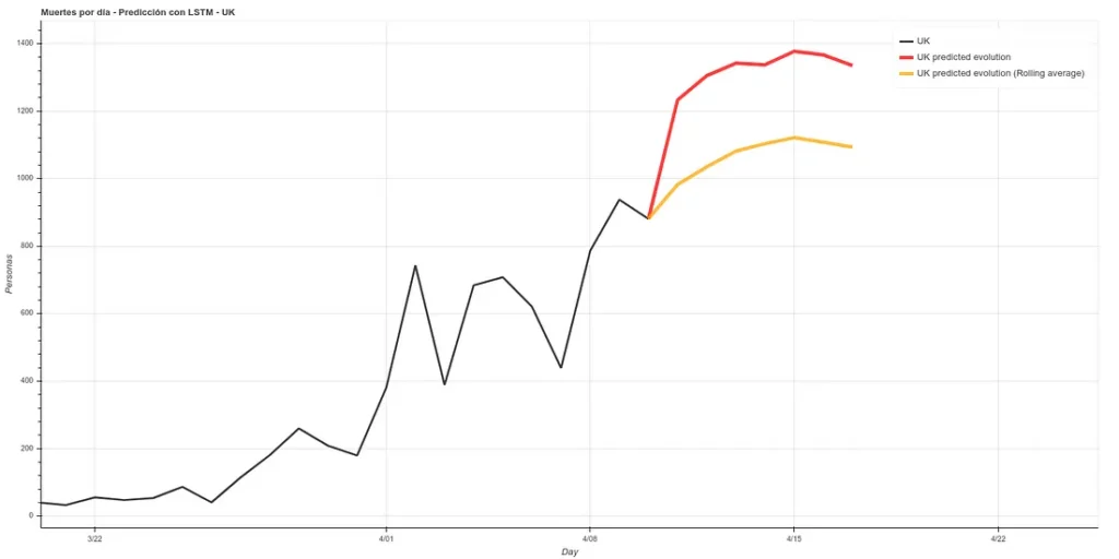
Note: the data in these graphs are different from those I added earlier. This is because the data I showed before to illustrate the comparison between our prediction and the real data were collected manually from the official account of the British Ministry of Health (https://twitter.com/DHSCgovuk) while the data I use to make the new prediction are the ECDC data, which, as I mentioned before during the article, usually have some delay in updating.
magnificent issues altogether, you simply won a emblem new
reader. What could you recommend about your put up that you simply made a few days in the past?
Any certain?
my site … Movers Calgary